

How to create a friendly User Interface
and NOT cockpit view

Thanks to Apple and Tesla, users of software now realize that a really good one has a lot of power behind it and they can learn about it overtime.
But the key reason you are using the software is easy to access and use. You can reliably trust that it will work and be understandable.
Regrettably, small developers and their team tend to forget this cardinal rule. And create and tweak version that I dub “Cockpit view”

A version that has way to many views, screens, and widgets that not only make you feel overwhelmed but also make you feel like one false move and you’re going to crash the airplane.
You do not want to distribute a software to the public unless the fan base is so rabid they’ll help overcome any friction from new buyers.
I don’t have that luxury and most others don’t either.
What occurs is usually exploding at your friends, family, and anyone using it “You don’t understand!”
No, the truth is the creator doesn’t. And the fact that until it’s being used, no one really cares.
It’s the main reason that creators from time to time swear up and down, yell at the gods, swear off developing further, and feel there is a cloudy sky over my head.
But I can’t sleep at night thinking about the opportunity I can serve myself and the general population so I fight.
Thanks to AI, I now have someone to run ideas by before speaking and organizing yet another task with my developers.
Now that I see results that are satisfactory I need to make it user friendly.
Here is the top part of the view you would see if you used my Beta version now.
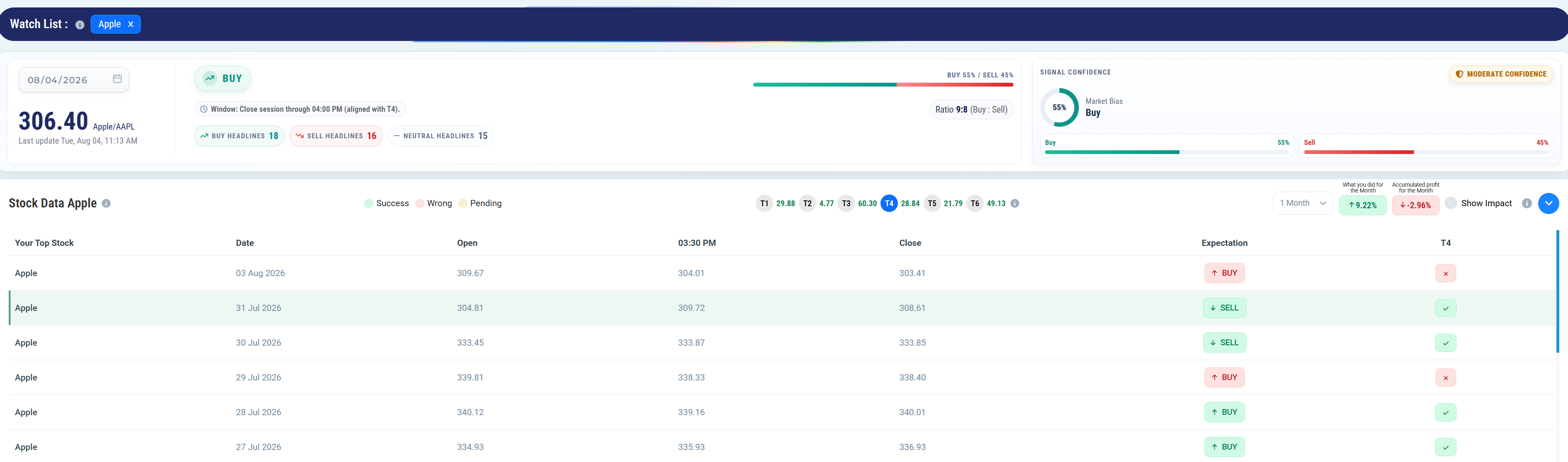
So what do you see?
and what questions will arise if you just simply view this?
I share with you what I sent to Claude for review, but also sent to development team. When you send it they normally just tweak what they have and do not do a reset, and start from simple.
Which I will be demanding later today.
While this may simply be a user interface for a beta version of a software you never used, it represents the thinking going into it like a movie, a stock, or politics.
Any output requires decision making and I’m sure you have always wanted to create as much as invest or critique.
What Claude recently shared with me SIX KEY CONCEPTS
Redundant signals. The same number shown three different ways, a pill, a bar, a donut, before the user reaches anything new. Every extra encoding of the same fact is a tax on attention, not an addition of information.
Ambiguous terms. Two labels that sound like they measure the same thing, “56% Market Bias” and “Moderate Confidence,” sitting side by side with no line drawn between them. If a user has to guess whether two numbers are related, the interface has already failed once.
Undefined jargon. Internal shorthand handed straight to the user, T1 through T6, InvScore, an 80% score with no unit, no context. Anything that requires the user to already know the system before they can read the screen isn’t a label, it’s a wall.
Invisible math. Inputs and outputs both visible, with the reasoning between them hidden. Sixteen buy headlines and fourteen sell headlines somehow become 56%, and nothing on screen shows the path. That’s not clutter, that’s a trust gap, and trust gaps are worse than clutter.
Flat hierarchy. Everything boxed the same size, same weight, same prominence, whether it’s the one number that answers the question or a supporting detail nobody needs at decision time. A screen that doesn’t tell the eye where to start hasn’t been designed, it’s been assembled.
Mixed timeframes. Historical performance and the live decision jammed into one view, one table, one column. “How good has this been” and “what do I do right now” are two different questions, and answering them in the same breath answers neither well.
No primary, no secondary, just a dozen equally loud boxes fighting the one number that actually answers the question: what do I do?
That’s the Cockpit View. Every gauge lit up, none of them telling you which one matters.
Steve Jobs’ whole bet was the opposite of that: hide the machine, show the decision.
That’s the demand I’m bringing to my developers today, not another tweak, a reset back to what the trader actually needs to see first.
Stay tuned Thursday and Friday. I’ll show you where the team pushed it after this.
If you want to test the software and be part of a new way of viewing the markets, subscribe today.
Make it a rewarding day,
Eric